Design and production for sustainable Interiors – Sanderson launch the National Trust Collection
.jpg?width=750)
Behind every printed metre of fabric there are numerous industry professionals, each of whom apply their skills to manufacture the beautiful textiles that dress our residential and contract interiors. The diversity of skills required within the textile production sector cannot be underestimated.
Digital technologies have unlocked the print sector and enable print-on-demand, and agile inventory management with short production runs using green technologies for efficient sustainable production.
However, the creation, design and production of furnishing fabrics requires an equally diverse skill set - creative talent and expertise.
Designers begin the process, working to a specified and detailed brief which will include a design budget and a defined product price point which must all be achieved in unison. Balancing the design and production process to achieve the required product in budget often creates operational challenges that must be overcome. The designer will track and supervise the products manufacture from design through to production to ensure that an exact replication of the painted pattern is achieved on fabric, whilst meeting the product launch CPA and specified budget.
It’s the inherent skills of the Textile designer that captures the aesthetic of the final printed furnishing using both digital and manual process, they continue to supervise the replication of the painted or hybrid digital pattern onto final printed production, whether digital or analogue (often also supervising the marketing photography). The commercial print designer specifies the printed substrate as part of the creative process, moving on to create and then control the requested colour palette to bring together a myriad of resources that together deliver a successful and commercially balanced textile collection. All of these steps are time sensitive and must be managed with care.
We caught up with Rebecca Craig the designer heading the Sanderson and William Morris collections for Style Library to discover both the creative and the production journey of their new furnishing fabric collection for the National Trust:
Can you give us a brief history of the Sanderson and other brands within the Style Library group?
We have six brands within the Style Library group: Sanderson, Morris & Co., Harlequin, Zoffany, Scion and Anthology.
Sanderson: Started by Arthur Sanderson in 1860 as a world-wide distributer of high-quality wallpapers, Arthur progressed to produce his own wallpapers and fabrics. Sanderson designs have always been diverse and distinctive, taking inspiration from nature, English country style and florals. This year, Sanderson is celebrating its 160th anniversary.
Morris and Co: William Morris started his decorating business in 1861 with a group of friends providing beautiful handcrafted products and furnishings for the home. He is regarded by some as the greatest designer of all time and one of the most outstanding figures of the Arts and Crafts movement.
Harlequin: Started about 30 years ago, the Harlequin brand means ‘varied in colour or decoration’. With its catwalk inspired looks and innovative design and production techniques, Harlequin fabrics and wallpapers help consumers create a confident fashion statement in their home.
Zoffany: Zoffany is our luxury brand for those that seek craftsmanship and artistic integrity. Taking a sophisticated approach, the studio draws on many different sources including innovative technology, contemporary designs and its own historical archive of weaves, velvets and wallcoverings, mostly dating back to the 17th and 19th centuries.
Scion: An upbeat brand for everyone, with zesty colours, clean Scandi inspired designs and fresh ideas for modern living.
Anthology: Anthology began in 2014 as an innovative new addition to the wallcoverings’ marketing with creative finishes and subtle textures for both the domestic and commercial market. In 2016 the brand added a collection of contract quality fabrics to continue Anthology’s edgy urban theme for contemporary spaces.
How did the National Trust collection come about for the Sanderson brand?
The National Trust approached Style Library about a collaboration, showing particular interested in Sanderson. We felt a natural synergy between the two brands in terms of their values, customers and shared love of the English Countryside – what could be more perfect!
What was the vision for the new collaborative collection?
-(1).jpg?lang=en-GB) Image Credit: Sanderson
Image Credit: Sanderson
The collaboration brings together Sanderson, whose floral themes are inspired by nature and the English countryside, with Europe's largest conservation charity, which has cared for places of beauty, history and nature for 125 years.
The collection brings to life the values of the National Trust and its commitment to caring for our natural and cultural heritage. It has taken inspiration from the breadth of properties and landscapes within the Trust's care and drawn on original documents from the extensive Sanderson archive to create a range of beautifully drawn botanical fabrics.
How did you research the project and what inspired you the most?
In terms of research, we worked closely with the National Trust team to highlight key places and projects that showed the breadth and diversity of the National Trust and the stories that they wanted to tell.
I have been a member of the NT for over ten years and have visited many of the properties with my family, however I was completely overwhelmed and delighted by the amount of inspiration and references we had to work with - it really is a designer’s treasure trove. The only problem was honing all the ideas down into a manageable collection.
In the end we decided the key thread of the collection was to evoke the special memories that are created by these outings and bring them back into the home.
We decided to concentrate on the following five captivating themes:
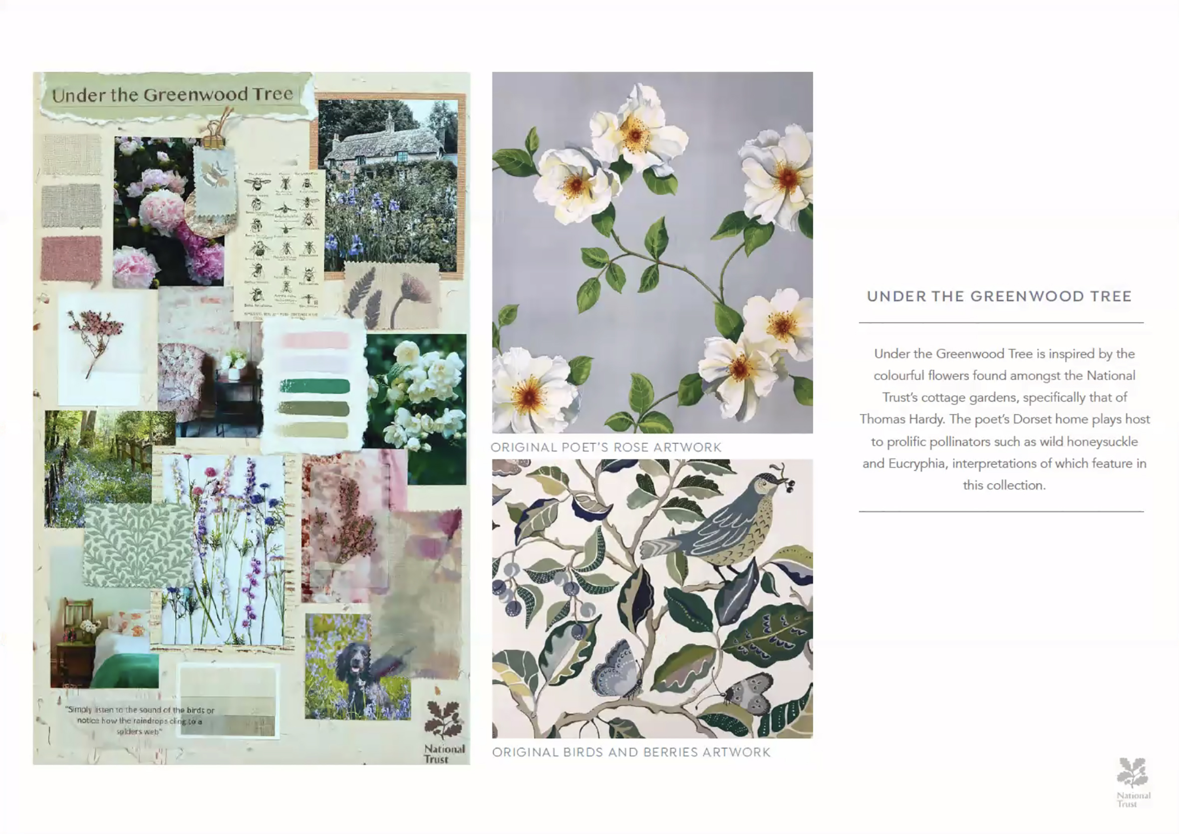
‘Under the Greenwood Tree’, ‘The Lookout’, ‘The Fens’, ‘Country House’ and ‘The Secret Garden’ each exploring the National Trust’s raison d'être, and when teamed with documents from the extensive Sanderson archive, creating a unique and compelling design story.
Mood boards are a great source of focus for designers, what are the most important key elements?
.jpg?lang=en-GB) Image Credit: Sanderson.
Image Credit: Sanderson.
We create mood boards and colour boards to communicate the look and feel of a collection even before we begin designing. They ensure everyone in the business is aligned to the vision of the project from concept through to styling. We often create multiple boards at the initial stages, these are a bit more like working boards that become curated over time. As collection creativity is a process, it is important to allow for new discoveries, ideas and changes so we often adapt and refine the concepts during the designing and colouration process.
The key to successful boards is the editing, as the materials and colours used and all the images need to work together to create a cohesive story.
How did you create the designs and using which technologies?
The collection is a mix of printed, woven and embroidered fabrics.
Most of the prints have been digitally printed with reactive dyes on BCI cotton linen blend.
Also, a couple of them have been printed using a new pigment printer (Durst Alpha) which reduces the consumption energy and water by about 30 percent.
The woven designs are either woven on a dobby or jacquard loom and the embroideries are made on a variety of embroidery machines.
The designs are painted by hand in a mixture of media from water colours, gouache and pencil crayons or inks, we use CAD technology to help us with the repeat layouts, separations and colouring prior to working with the mills.
How do Style Library prepare their design colourways and control management across the rotary and digital workflow? Screens / Digital sampling?
At the start of each project we have a planning brief which gives the studio a summary of the size of the collection, the product mix and price point we need to achieve.
We then start planning the collection in terms of the individual designs and how they will be produced. All the different production methods have different repeat sizes, numbers of colours and other technical details that need to be considered prior to designing.
For each theme we researched the place or subject matter in more depth to come up with a create brief for the designer, so they have a clear understanding of the look and references to use. For ‘The Fens’ we looked into the native species of the area to put into the design, as well as the general mood and lighting at different times of the day.
The designer creates a layout, usually as a pencil sketch, and we work on the colour distribution within and how other colourways may be affected. Then the designer creates a number of small paintings in different painting techniques and medias, until we feel that it is ready to go to final artwork.
Once the designs are complete, we again assess the suitability for different processes, for embroideries and weaves the designs have to be created in a specific way to translate well into the different processes. We frequently specify the type of embroidery stitching in the different areas of the design, the composition of the base and the colours of the grounds and yarns we want sampling. They are produced in small samples for approval of stitch, coverage and colour. With woven designs, we often start with a quality sample which establishes the type of yarns performance and number of colours we can use within the design. The different colours are woven on a blanket with about eight warp colours across the width and a variety of wefts.
Print designs are generally colour separated by layers to allow us to change colour and we put palettes together and create initial ideas in the studio using CAD, then take them up to the factory to be sampled on various cloths.
Colour is communicated via paper printout LAB references, yarns, fabrics, paint swatches and digitally. We use outside suppliers for weaves and embroideries and generally work with yarn cards or Pantone swatches.
Once everything has been sampled, we make our final selection for the collection and start planning the photography whilst the bulk production is underway. The whole process takes 6-9 months.
How important was sustainability to this collection? And can you tell us about the fabrics used?
We felt that it was imperative to align ourselves with the National Trust’s values and initiatives in terms of restoration and conservation and to make the collection as sustainable as possible. Fortunately, at the time, ‘Standfast and Barracks’ our printers in Lancashire, were developing and investing in a new digital technology to enable us to improve the environmental impact of the production processes.
For this collection all the printed fabrics excluding the velvet have been printed on ‘BCI’ (Better Cotton Initiative) cloth which ensures sustainable cotton production around the world.
We used the new pigment print digital printer (Durst Alpha) for the first time in this collection which requires less cloth preparation and finishing processes meaning a substantial reduction in energy and water usage.
Have you seen a growing demand for sustainable textiles within Style Library’s client base?
The desire for sustainable textiles has been around for at least ten years, however it has been very difficult to implement as the production methods and base materials have been difficult to control and often price prohibitive. We are seeing a new wave of interest however, where retailers and consumers are not just requesting ethical and sustainably produced goods, but are expecting it and prioritising it within their brand DNA.
This is leading to a much more exciting accelerated change from the base source to the producers so that end consumer has more choice and doesn’t have to compromise style, comfort or performance when committing the a more sustainable product.
In the luxury sector we are seeing a creative and extremely exquisite use of natural materials being adopted to stunning effect.
How do you see the future of Digital production, do you intend to convert historic patterns to a digital workflow and also increase its use within the group?
.jpg?lang=en-GB) Image Credit: Sanderson.
Image Credit: Sanderson.
The advantage of digital technology is reduced environmental impact, lower minimums and often higher quality design translation, so it makes sense that the majority of designs are produced in this way moving forward.
We always look at a print design and colourway on a case by case basis to see whether it is suitable for conversion, ground colour and cloth options will often dictate how the design is produced.
I have a personal love of flatbed printing for the colour penetration on the fabric, the print mark and the overall look of a hand printed or conventionally printed fabric and endeavour never to compromise the integrity of the design, particularly when it comes to historical documents.
Digital wallpaper is becoming more and more popular, particularly for large scale panels, however metallics, beading and surface inks and other special effects cannot be replicated using digital technology so we are still using a variety of processes.
Interested in joining our community?
Enquire today about joining your local FESPA Association or FESPA Direct
Recent news
.png?width=550)
Why are FESPA events the ideal place for visionaries to meet? With Harold Klaren from EFKA
We speak to Harold Klaren, International Sales Manager at EFKA about visionaries in print. Harold shares why he believes FESPA events are the ideal place for visionareis to meet.

NSELED to showcase Innovation and transformation at European Sign Expo 2025
NSELED Europe, part of leading LED display technology provider NSE, will welcome visitors to its stand at the European Sign Expo 2025. Ahead of the event, we speak with Daniele Rocca, principal chief executive officer at NSELED Europe, about what to expect from the company as the official ‘Digital Screen Partner’ of the event.

Why the Future of Print Is Personal – and What That Means for Your Business
Minna Philipson, CMO at Gelato shares how the future of print is personal, driven by demands for tailored, localised, and on-demand products. Businesses must adapt, embracing software to streamline operations and building customer-centric brands. Personalisation is key to connection, requiring emotional storytelling and flexible operations to thrive in the evolving market.

The latest sustainable solutions in non-digital signage
While by no means a new concept in the market, sustainability is becoming an increasingly important part of daily life for sign-making businesses. Here, Rob Fletcher shares some of the non-digital materials to help companies become more planet friendly.