FESPA Coffee Break: setting up more effective colour workflows

In this FESPA Coffee Break, we brought together two colour management workflow experts to explore ways in which workflow efficiency can boost profits.
The host: Graeme Richardson-Locke: Technical support manager, FESPA. With 35 years’ experience in the industry, Graeme began as an apprentice and progressed through several directorships before joining FESPA in his current role. He is also a member of the Academy of Screen and Digital Printing Technologies.
Paul Sherfield: Founder and owner of The Missing Horse Consultancy, helping clients to maximise their possible savings and increase the efficiency of digital workflows.
Toby Burnett: Director, EMEA & Americas, of PrintFactory – providers of specialist workflow software for wide format printers.
Let's start with the process-controlled workflow, how do you approach it, and how do you ensure return on investment?
Paul Sherfield: It's about giving your clients’ trust in the way you process their images, their pages, their point of sale, their textiles, their banners, their posters. It's also about making that production seamless, efficient, and accurate. What we're talking about here is managing your colour completely through the workflow. You engage your clients in this process by helping them get their colour settings right, and providing colour profiles which you'd like them to use. You can offer them education in this area as well. Then it's about setting up your own internal systems through colour workflows which match your wide format presses, your screen printing presses, and the substrates which are going to be printed on those presses.
It's a complete colour management workflow that involves screens and desktop programs like Adobe CC; it involves PDF standards plus PDF/X. As well as making your clients happy, you’ll get a clear return on investment from installing such a workflow status system. It will reduce waste, it will reduce reworking, and it will reduce the number of awkward conversations your customer-facing staff have with your clients.
Toby Burnett: For us, a process-controlled workflow involves an array of applications designed to work together and reduce compatibility errors. We have a single PDF file in our workflow rather than making multiple files. All the applications work around that one file and each application uses the same PDF engine. What you see on screen is exactly how the RIP is going to produce the job. This allows you to reduce the number of repetitive tasks because the applications are based on templates.
One of the challenges in large format digital is that there's a lot of variation in the types of jobs that come in. It's quite complex to fully automate so we help people with that. As they get used to reducing repetitive tasks, they can start to automate that connectivity to other systems.
Let’s now look at file formats and the issues that arise out of those.
Paul: There's a certain amount of client education involved here. You can look at it in two ways depending upon how you're marketing your product, what clients you have, and what their expectations are. Client expectations need to be set very clearly as you're getting to colour-manage workflows. On one hand, you can say, "Well, we will take anything from our clients. InDesign files, Illustrator files, PowerPoint files, whatever, and we’ll do the best job possible with them”. Or you can say to your clients, "I would really like them supplied as this" – and give them the Adobe colour settings files so that they can make beautiful PDFs to your standard, give them your profiles and try and educate them. But most people take a halfway house with this. They will endeavor to get the best files they can from their clients and then still spend quite a lot of time putting them right.
Where you've worked with pre-media clients, how ready are they to accept this guidance and support from printers? Is your experience very positive in this?
Paul: Certainly, I do a lot of training of graphic designers. One comment I often get is “Why weren't we taught about this colour management at college?” Too often, young designers come out of college knowing a lot about multimedia, but very little about printing. It seems to be ignored in a lot of design colleges.
It just reflects the need for this work, doesn't it?
Paul: Yes. Most designers would never have opened the colour settings panel within the Adobe CC programs, which is the heart of colour management. Then coming back to what the print service providers should do, you've got to develop standard colour workflows which suit your product, your substrates and the presses you’re using, as well as reflect your customers’ needs. It starts and ends with the customer. To meet their needs and make them confident in what you're doing, it’s important to involve them in what I call a ‘wide area colour workflow’.
Toby: It's interesting what Paul said about colour management responsibility starting at the design stage. Built into PrintFactory is a proofing option, and recently we created a standalone proofing product aimed specifically at the sector that Paul talks about, because conventional contract proofing products are quite expensive. We built a product to work with a simple Epson or Canon printer for under £700. The idea of that is these people can afford to start taking some responsibility.
And inside PrintFactory is one RIP that we’ve created ourselves. You can get some predictability at the desktop as to what's going to happen with the file, but if you need to change your workflow and move from the latex to a JETRIX or a Colorado, you're going to get the same result. If, on the other hand, you're using different RIPs, there's a strong likelihood you're going to see different results.
What can you tell us about screens, monitors, desktop software and print viewing conditions?
Paul: We look at where colour management takes place, and the starting point is a computer screen. This causes a lot of confusion for clients and sometimes for printers. We no longer have that comfort zone of having a transparency or colour printer and a light box, which people were very happy with when selecting viewing and marking up proofs. We just have a computer screen and sadly, not all computer screens are created equal.
Right now I’m looking at Toby and looking at Graeme on a 27-inch, very high-end, colour correct, colour-calibrated screen. But they cost over £1,000. Most clients will be working on £200 to £300 screens connected to PCs. They cannot be colour accurate as they can only produce a limited gamut. They will never view the beautiful RGB images taken by a photographer or even the converted CMYK images that you may provide for them to approve.
This needs to be very clear when you are sending a PDF for approval. They should only be for content, not for colour. This causes a huge amount of confusion and cost to our industry because people who don’t know any better will make comments on the colour. If you want to look at colour and judge it accurately on screen, you need to buy one of these high-end screens with an Adobe RGB Gamut. These screens then need to be calibrated and profiled, which usually comes as part of the screen package, and it uses something called a colorimeter on the screen. It is the start of colour management and it can be used throughout the colour-managed workflow, not only to view images but to view colour-managed PDFXs.
Let me come next to the Adobe colour settings files. There's a series of pre-set ones which comes with Adobe CC. Check those out, and you'll see they're pretty limited, but you can create your own, and export these profiles, which are cross-platform, with the colour settings files, and give them to your clients. A very interesting start to getting your clients working in your way.
Adobe Bridge is a good place to start. You can make those universal settings in Bridge across all your applications.
Paul: Yes. Once you've got your colour settings and you're working on a project and you know what your colour management should be through Adobe Bridge, which is a super finder application in Adobe CC, you can synchronise your colour settings from Acrobat back to Illustrator, back to InDesign, and back into Photoshop. It's very powerful. A lot of companies now will actually put on their work tickets what colour workflow their pre-press people, their designers, should be working in from day one.
Toby: We'd always recommend that people who are doing the colour-conscious part of pre-press would use a screen that's calibrated. Unfortunately, that's not always the case.
I also don't understand why you would submit a print job without a proof in hardcopy somewhere in the workflow. When we look at colour management, colour management takes place assuming there’s a lighting condition of D50. Up until a few years ago, D50 didn't take into account for UV content and the light source, and the ISO (Industry Standards Organization) tightened that up with a standard that was first set in 2009. It's the 3664 standard. What that means now is that a spectrophotometer, a viewing condition light, and the colour management calculation were all based on a set of tighter tolerances for D50.
That also gave us the Delta-E 2000 standard, which is more akin to how we see colour as opposed to a very technical and absolute standard. The trouble with D50 is that if you're producing point of sale or if you're working, say, in the textile industry, then what you're going to find is that the environment that people are making purchasing decisions in is not the environment that the controlled lighting and the calculations were taking place in.
The next question is on colour management in the digital front end of RIP and the importance of device profiles.
Toby: People perceive colour management to be this dark art and very difficult. It's actually quite simple. If you work on the premise that all devices print differently – even two devices out of the same factory – then basically, they need a device profile.
What we would say is most people just use whatever RIP they got with the printer, often for free, and they'll use the generic profiles probably made in 2011 somewhere. And that means they're going to print wrong, because different is wrong. You've got to have a common colour appearance or common Delta-E tolerance between devices.
Paul: The key takeaway here is whatever you do, however you do it, you don't create a device profile which describes a particular press on a particular substrate. I visit wide format clients and they’re reprinting a job, not because they got it wrong, but because the client wants six or seven more banners. They're saying, "The press it was printed on is down and we can't print it on any other press because we want it the same." This is what colour matching is all about. Predictability. You are printing the expected.
If you're in a print-on-demand scenario, where you're running files repeatedly every other day of the week, then you just have to have that process control in place, don't you?
Paul: Yes. When you display an image on a colour-managed profile screen, the colour management system is recognising the profile of the image, talking to the colour management system in the computer, talking to the colour profile of the screen, and displaying it as accurately as it can.
Then, within the digital front end, you might be introducing an output profile, a FOGRA39 or FOGRA51-based profile. What your client wants is for his banners to look like his leaflets, and like the point of sale material he’s put up elsewhere in the store, or in the office, so you're matching a colour expectation.
Toby: When somebody was teaching me how this stuff works, they basically said, "Every application speaks a different language and the profile is the translation between those different languages." When they said that, I got it. If you don't have an accurate profile, the translation is all over the place.
Print quality assessment and validation. We all recognise value and measurements, but what are the key benefits that you'd highlight about this?
Paul: This is at the final end of colour-managed workflow. You've controlled the image, you've controlled the creation of page, the documents, the package, the banner. You've produced a beautiful colour-managed and correct PDF/X. You've proofed it, controlled the system beautifully, and gone through whatever colour system management you've put in, and you're printing the job. How would you know that job is accurate? Generally, you're comparing it with a proof. Process control in this case is actually a way of validating your printed sheets, banners, textiles against the chosen output condition.
Either that or you might be printing to the maximum gamut of the press using the device profile, or you might be trying to simulate a FOGRA39 based profile. By putting in something called the FOGRA Media Wedge and measuring the number of patches or even smaller patches, you can check them against your intended output intent and actually give information back to your client. Also, it's a very good diagnostic tool because it will give information back to you as a printer to see if your press is on track and doesn't need recalibrating or reproofing again. That's a very powerful tool to validate your printed work.
Toby: I'd second that the quality assessment or print standard verification closes the loop completely, and it justifies the whole end-to-end process: what you're finally going to give back to the customer is what they expected to see in the first place.
Watch the full recording of this FESPA Coffee Break here.
Topics
Interested in joining our community?
Enquire today about joining your local FESPA Association or FESPA Direct
Recent news

The importance of ink for large format printers
Ink is crucial for large format inkjet printers, influencing substrate compatibility, productivity, and cost. Nessan Cleary discusses the three main types which include UV-curable ink, latex ink and eco-solvent ink. Each ink type has specific strengths and weaknesses, making printers choice dependent on budget and intended applications.

What are the benefits of Direct-To-Fabric printing?
Direct-to-fabric printing is gaining popularity for high-volume textile production, enabling on-demand, customized short runs. These printers offer ink flexibility, accommodating various fabric types like cotton and silk, though ink development focuses on faster turnaround by reducing pre- and post-processing. Compared to traditional methods, direct-to-fabric inkjet printing is a more sustainable option due to reduced water and chemical usage, and localized production.

What are the opportunities for large format providers regarding digital touch screens?
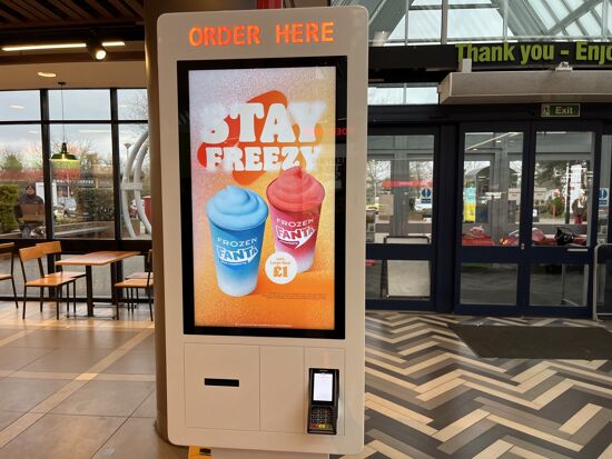
Digital touchscreens are becoming increasingly common, offering businesses opportunities to improve customer engagement and streamline operations. Nessan Cleary shares, while more expensive to implement than standard digital displays due to complex software and integration needs, touchscreens provide self-service options, multilingual support, and can reduce staffing costs in various settings like retail, transportation, and healthcare.
