Standard lighting conditions for wide format printers and their many markets

Paul Sherfield shares the various standard conditions that are required for wide format printers as colours can appear differently dependent on the differing types of lighting and environments.
Viewing proofs and printed products when in production under standardised lighting conditions is the only way to ensure confidence in the colour match. The normal graphic arts lighting and viewing conditions for this are based in the D50 lighting standard as defined in the ISO 3664-2009 document.
These standardised conditions are needed as colours can look different when viewed under differing types of lighting and environments. This is usually referred to as metamerism. Two colours that appear to match under one type of lighting will not match when viewed under a differing light source. The is due the differing light spectrums and colour temperatures. This is more correctly called metametic failure.
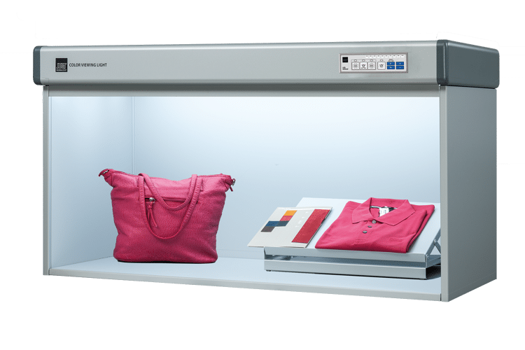
So, what is D50? It is based on a colour temperature of 5000k along with other values such as CRI (colour rendering index, CIE Ra (CIE 1995) , how accurate the colours viewed will appear on a scale of 0-100. It also covers the physical environment in which the proofs and production prints are, such a light booth and viewing workstations on presses.

While the graphic arts area has used D50 lighting as its viewing standard with some success for many years, many other industries have used the D65 lighting standard, including, rather oddly, the paper making area which one would have thought should use the same D50 lighting conditions as its major customer, the printings industry.
ISO 3664 outlines specific criteria for lighting conditions to ensure accurate color evaluation for the graphic arts sectors. These parameters include:
- Illuminance: ISO 3664 recommends an illuminance level of 2000 lux, measured at the viewing surface. This level ensures sufficient brightness for evaluating colours without causing visual discomfort or glare.
- Uniformity: Uniform illumination across the viewing area is vital to prevent inconsistencies in color perception. ISO 3664 mandates uniformity within a specified tolerance to maintain accurate color assessment.
- Spectral Power Distribution (SPD): The spectral distribution of the light source significantly influences color appearance. ISO 3664 defines the SPD of D50 lighting, ensuring that it closely matches natural daylight characteristics.
- Color Rendering Index (CRI): CRI measures the light source's ability to accurately render colours compared to natural daylight. ISO 3664 requires D50 lighting to have a CRI of at least 90, guaranteeing faithful color reproduction.
ISO 3664 is being revised at the moment with the intension to including an additional specification that excludes the UV content in the D50 light source. This is being driven by several factors; most lighting is based on LED’s which do not have any UV content and that fluorescent tubes are now banned in Europe and increasing in the USA on State-by-State basis, so LED D50 tube replacements are now needed for the many installed viewing booths.

The present the graphic arts sector with a number of challenges in the measurement, colour profiling and process control areas, which we will cover in more detail in another article.
Challenges with D50 Lighting Across Industries
While D50 lighting is integral to the graphic arts industry, its adoption faces challenges in other sectors due to various reasons:
- Retail and Consumer Goods: In retail environments, such as clothing stores or supermarkets, the emphasis is on creating inviting atmospheres to attract customers. While D50 lighting offers accurate color representation, warmer lighting is often preferred for its cosy ambiance. This disparity in lighting preferences complicates the adoption of D50 lighting in retail settings.
- Photography and Filmmaking: While photographers and filmmakers strive for accurate color reproduction, artistic expression often takes precedence over technical standards. Many professionals opt for customized lighting setups tailored to their creative vision, deviating from D50 standards. Additionally, on-location shoots face the challenge of unpredictable natural lighting conditions, making strict adherence to D50 impractical.
- Architecture and Interior Design: Architects and interior designers utilize lighting not only for visibility but also for ambiance and mood enhancement. While D50 lighting may ensure precise color evaluation during design stages, it might not align with the desired atmosphere once implemented. Consequently, designers often resort to warmer or cooler lighting options to achieve specific aesthetic goals.
- Healthcare and Well-being: In healthcare facilities, lighting serves multiple purposes, including patient comfort, staff efficiency, and accurate color perception for medical tasks. While D50 lighting might be suitable for certain clinical applications, such as color assessment in pathology labs, it may not meet the diverse lighting needs across different areas within healthcare settings.
The range of daylight-based D illuminate standards are D50, D65 and D75 which all approximate the daylight spectrum. These standards give a progressive lighting colour temperature from a the ‘yellow’ D50 to the ‘bluer’ D65 and D75.
Conclusions
In the graphic arts industry, adherence to ISO 3664 lighting standards, particularly D50 illumination, is imperative for achieving consistent and accurate color reproduction. By providing a standardized viewing environment, ISO 3664 ensures that colours appear as intended, facilitating reliable communication between designers, printers, and clients.
However, the widespread adoption of D50 lighting across other industries remains a challenge due to varying priorities and preferences. While D50 lighting excels in color accuracy, its compatibility with different contexts requires careful consideration of factors such as ambiance, visual comfort, and aesthetic preferences.

The diverse markets that the wide format printing sectors covers does make the choice lighting conditions more difficult. Viewing booths are available with multiple switchable, light sources which can help. The light sources can include, D65 (average daylight from the northern sky), A (incandescent lamp), TL84/F11 (store lighting) and D50 (noon daylight0.
As industries continue to evolve, bridging the gap between technical standards and practical applications becomes essential. Whether in graphic arts or beyond, understanding the nuances of lighting conditions is crucial for maintaining quality, efficiency, and visual integrity in market areas served by the wide format sectors
The issues raised in this article does cause one to wonder if D50 (5000k) lighting conditions is the correct specification for the wide format printing sector or even for the wider graphic arts and printing markets. As can be seen, many of the sectors suppliers and clients do not use D50 as their viewing standard and consumers domestic lighting have changed to LED with no UV content.
On the other hand, D65 (6500k) lighting is considered by some to be a very harsh ‘blue’ light and far away from the domestic lighting that consumer clients use which is around 3000k-4000k, giving a much warmer light
Hopefully this article may result in some discussion re this area.
Interested in joining our community?
Enquire today about joining your local FESPA Association or FESPA Direct
Recent news

Kernow Coatings to showcase innovative solutions at FESPA 2025
Kernow Coatings will showcase innovative, sustainable wide-format printing solutions at FESPA 2025. Highlights include a collaboration with Ricoh for a space-themed booth, featuring KernowJet MetaliK and Interiors Structured Silver. They'll also present recyclable wallcoverings and PVC-free media, emphasizing high-performance, eco-friendly options.

Understanding the differences and similarities between monitor and RBG Device ICC Profiles
Paul Sherfield explores the the intricacies of RGB monitor profiles and RGB device profiles, uncovering the challenges and considerations that we can face in the colour management field face daily.

European Sign Expo: Where Visionaries Meet
In under one month’s time, sign makers and visual communications specialists will congregate at European Sign Expo 2025 to see the latest technology developments and trends across the sign industry.

From Imagination to Fabric: Exploring Generative AI with ROQ and Printbox
ROQ and Printbox's upcoming session at SmartHub Conference at Personalisation Experience will demonstrate real-time AI-powered t-shirt personalisation. Attendees will be able to create designs with AI, printed live on ROQ's DTG printers. This will showcase the power of combining generative AI with on-demand printing, revolutionising customer experience and apparel customisation.