Very large graphics - Part 2: Artefacts and how to tame them
Simon Eccles gives key tips and techniques for preparing images to look their best in large format.
In part 1 of this story we looked at how understanding and controlling resolution is vitally important if you’re going to be reproducing photographs and other artwork for very large format printing.
This time we’re looking at other things that may affect image quality when viewed close-up, such as file compression and image sharpening. First though, we’ll consider what to do if you receive a job file that isn’t just a single photograph to be enlarged.
Layout files and PDFs
It becomes less easy to fix resolution and other image problems if the original images have been placed into a layout program, such as Adobe InDesign or Illustrator, QuarkXPress or CorelDraw, where the photographs are combined with vector elements such as text and boxes.
These programs don’t give you a numerical readout of the final pixel resolution of the placed page, though some (especially InDesign) will show a realistic preview that should predict a resolution problem as long as it is viewed at 100% on-screen. However some designers just lay out the correct job shape but not the final size, so that wouldn’t work either.
Layout files are often sent to printers in the PDF format. The PDF essentially acts as a “wrapper” to display and print the images and other elements within it.
If you have a PDF and need to check and increase resolution, you can use Adobe Acrobat Pro (or the current DC) to extract (ie “unwrap”) image files and save them separately, then open up the relevant ones in Photoshop to check and fix any resolution issues. It’s easier to use Adobe Illustrator, which can open and edit PDFs with more tools than Acrobat provides.
Acrobat can increase pixel counts in its Optimized PDF menu, but only by using “nearest neighbour” techniques so the quality isn’t improved.
A dedicated PDF editor is preferable, of which Enfocus PitStop Pro is the most affordable (starting at €608 but with an annual subscription option of €261). This runs as a plug-in to Acrobat and provides an extensive set of manual and automatic editing tools as well as pre-flight checking. It has better interpolation tools than Acrobat (with Bicubic, Bilinear and Bicubic B-Spline, but you may still be better off exporting images, up-scaling or replacing them in a proper image editor, and then re-importing them.
A lot of this repair work depends on how much time you’ve got, and whether the customer understands the principles of image quality enough that a printer can return bad images with a request that they’re fixed.
Artefacts

Sections of a TIFF file with lossless LZR compression, compared with a medium-high JPEG with compression set to 5.
Apart from the issues of resolution, the other major two factors that affect image quality on major enlargements include whether (and by how much) the images have ever been sharpened and whether (and again by how much) the lossy JPEG file compression has ever been used on the image.
Both can produce visible effects and patterns in the image that become painfully apparent if the image is subsequently enlarged a lot. Typically you’ll see pale or dark haloes along edges, blurring of detail and square blocks in what should be smooth gradations such as sky colours and skin tones.
Ideally, an image destined for large-format printing should never be saved as a JPEG file. This “lossy” technique works by progressively throwing image detail away to reduce the file size by significant amounts. Customers like JPEGs as they keep the file sizes own for e-mailing. However, they tend to overdo the amount they select.
Light compression (10 or 12 on the Photoshop scale) is usually fine and will typically reduce the file size to a fifth or tenth of the original without causing significant image quality loss. You should discourage customers from using lower down the quality scale, 8, 5 or worse.
The problem is if an image file has been passed around a bit. Someone at an earlier stage may have been tempted to apply high compression JPEG without you knowing. Quality lost can never be regained, so even if the file is opened and re-saved with light compression, the damage is done forever.
The best workflow to ensure top quality is to start with the original camera file (which will be Raw if a decent camera is used) and save it as TIFF with LZW lossless compression. This keeps the full quality of the image at about half the original file size, and can be placed in any standard layout program.
If a layout is to be converted to a PDF in InDesign, QuarkXPress or the like, then either switch compression off in the PDF set-up controls, or choose a High Quality Print option that will apply minimal JPEG compression.
Sharpening

Using the preview in Photoshop’s Smart Sharpen to judge when the effect will be intrusive at high enlargement.
Artefacts due to sharpening are likewise hard to fix if the result becomes too obvious when enlarged. Most digital photographs and scans need at least some sharpening, which can really improve the appearance. However the effect usually relies in part on increasing the contrast around edges (either darkening or lightening them depending on the surroundings) and this can appear as a halo if later enlarged.
Most image editors or Raw converters give you sharpening tools (such as Photoshop’s Smart Sharpen or Unsharp Mask). Where the menus give you manual controls, one of them usually involves the width in pixels that the effect covers. Between 1 and 2 pixels on a 24 mp image is usually fine for most pictures that are adequately in focus.
This effect may or may not become obvious if the image is later enlarged. It’s best to play around with to preview various effects in conjunction with the resizing tools, which may not be possible if a client has supplied an image that has already been sharpened.
If an image has noise or film grain, the sharpening process may exaggerate this. You can reduce this somewhat by fiddling with the amount and threshold settings if you’ve got them. Otherwise a more time-consuming technique is to mask out skies, smooth skin tones and anything else that you don’t want to be sharpened before going into the Sharpen menu.
If you’ve been supplied with an image where sharpening has exaggerated grain, you can reduce this by masking out areas that look noisy and applying a slight blur. Use a soft edged brush for the masks or you’ll see transitions between sharp and unsharp.
Lens aberrations

Enlarged sections showing purple chromatic aberration on the left, removed in Photoshop Raw on the right.
A common source of green or purple coloured fringes (or haloes) around fine detail is chromatic aberration (sharpening haloes tend to be light or dark versions of adjacent colours). This is an optical effect produced by all but the most expensive camera lenses which may be exaggerated by the camera sensor. Cameras that export JPEG rather than Raw often remove this automatically, but as we’ve seen elsewhere, Raw is better for ultimate image detail.
Most Raw converters (such as Photoshop Raw, Adobe Lightroom, Corel Aftershot Pro, DXF Optics Pro, PhaseOne Capture One), have tools for reducing chromatic aberrations in images. Some are manual, others can be pre-set and saved for particular camera/lens combinations.
If you’ve been supplied with an image that wasn’t fixed at the Raw stage, then The Raw Filter in Photoshop CC has a menu called Lens Corrections that has very adaptable “Defringe” sliders for green and purple fringes.
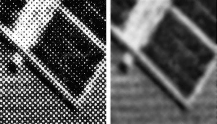
Halftone originals

This image started life as a 133 lpi halftone scanned from a 1948 book, and was processed to a continuous tone.
As noted in part 1, retail stores, banks and even art galleries often put up large murals showing their local areas in the past. Often these are taken from old black and white photographs, and sometimes they are from newspapers or travel books that were originally printed as halftones. If you blow up a scanned halftone, you see the dots. Very often this is evocative of a time and is exactly what the designer wants.
However, it is possible, just about, to make the dots invisible. Most flatbed scanners offer a “de-screening” option, where you tell it roughly what the original halftone resolution was and it will then take groups of dots and blur them until they are a uniform grey (or colour). Sometimes it works well, sometimes it doesn’t. It tends to work better with black and white halftones than colour, but many historic photographs were printed black and white anyway.
An alternative technique that I used on monochrome halftones in a republished book ten years ago, is to switch de-screening off and scan the image as a greyscale in the highest resolution available. This produces a huge file with every dot in sharp detail. Then experiment with Photoshop’s blur tools, applying just enough for the dots to disappear and smooth out.
Next you Resize the image down to the output resolution you want to print with. Finally experiment with the image enhancement tools, especially tone curves, contrast and sharpening, until you get a good result. I found this works better than the built-in scanner de-screening, but takes a lot longer.
Vector graphics

Vector graphics can be enlarged with no quality loss. The curves on this tiger’s eye are still perfect at 1,600% enlargement.
So far we’ve only considered bitmap images made up from pixels. These are normally photographs but may include artwork produced by a painting program such as Corel Painter.
The other main type of graphic program uses vectors, ie mathematical descriptions of lines and shapes and blends. These can be blown up to any size you like with no quality loss, with perfect curves, diagonals, type and colour gradations. The most popular vector programs are Adobe Illustrator, CorelDRAW, CADlink SignLink, SAI Flexi (previously called PhotoPrint) and a relative newcomer, Serif Affinity Designer.
Illustrator and CorelDraw include painting tools that put brush-like effects along vector lines and shapes. These effects can also be scaled up infinitely without quality loss. They also include raster-to-vector conversion tools that basically take true photographs and convert them to vector images in up to 256 tones. If you have a low res image and need to really blow it up, it may be worth experimenting with these tools.
Layout design programs also work with vectors: Adobe Illustrator and QuarkXPress being the main ones today (note that most of the “design” programs also do layout for single-sheet images). Any shapes and colour fills they create, and any type set, will be vectors. They can also import and preserve vectors from design programs.
However, an imported and placed bitmap image made from pixels, will stay as pixels when you print it. Enlarging a placed pixel image in a design program file will not interpolate it, and if it’s low resolution to start with, you’ll see the pixels when it’s printed in large format. It’s important to set the correct resolution before you place an image in a layout file.
This pair of stories has been a quick introduction to the considerations and techniques for preparing images to look their best at high enlargement. Experienced users will know about all these and more already, but you rarely see anything actually written down that addresses very large format image preparation.
Topics
Interested in joining our community?
Enquire today about joining your local FESPA Association or FESPA Direct
Recent news

The importance of ink for large format printers
Ink is crucial for large format inkjet printers, influencing substrate compatibility, productivity, and cost. Nessan Cleary discusses the three main types which include UV-curable ink, latex ink and eco-solvent ink. Each ink type has specific strengths and weaknesses, making printers choice dependent on budget and intended applications.

What are the benefits of Direct-To-Fabric printing?
Direct-to-fabric printing is gaining popularity for high-volume textile production, enabling on-demand, customized short runs. These printers offer ink flexibility, accommodating various fabric types like cotton and silk, though ink development focuses on faster turnaround by reducing pre- and post-processing. Compared to traditional methods, direct-to-fabric inkjet printing is a more sustainable option due to reduced water and chemical usage, and localized production.

What are the opportunities for large format providers regarding digital touch screens?
Digital touchscreens are becoming increasingly common, offering businesses opportunities to improve customer engagement and streamline operations. Nessan Cleary shares, while more expensive to implement than standard digital displays due to complex software and integration needs, touchscreens provide self-service options, multilingual support, and can reduce staffing costs in various settings like retail, transportation, and healthcare.
