Steve Upton at CHROMiX and colour managed workflows

How ColorThink software lets printers match colours correctly.
Steve Upton was there at the birth of modern colour management: he started his company CHROMiX in 1998 – the same year Adobe released Photoshop 5.
“Photoshop 5 was the first piece of software to support ICC profiles. Seeing a company like Adobe give a public show of support for this format and this technology was a big deal,” Steve says.
Steve’s professional background was in computer support and much of his working life had been spent supporting business in sectors such as photography and visual imagery.
“I started to realise that ICC profiles were kind of like a black box,” Steve says. “It was an open standard but it was treated as this thing that you allowed software to build for you to use, but when it didn’t work, it was very difficult to figure out why. As I have a degree in computing science, I rolled up my sleeves and started to build a tool that I thought could help to open up ICC profiles and demystify them. That’s what became ColorThink and then afterwards, ColorThink Pro.

Steve Upton, CHROMiX
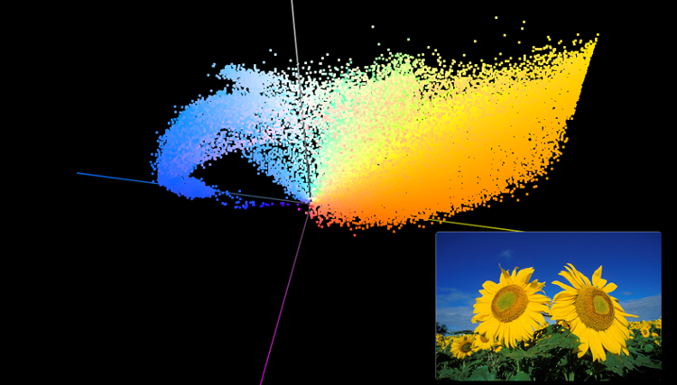
“I wanted it to be a suite of tools to manage ICC profiles and look inside them to see if there were any problems. Almost as an afterthought, I added a graphing ability. Then I added 3D graphing and that became the feature that everybody really likes about ColorThink: the opportunity to graph printer colour gamuts, monitor screen colour gamuts, and the ability to bring in images and graph those as a cloud of dots and compare them with your printer’s abilities. That was a big hit in the photo world initially, as they were the first people to really grasp the potential of this new area of colour management.”
Settings are not colours
When it comes to the importance of colour management, Steve has a metaphor he likes to use.
“Imagine getting up in the morning and putting on some toast. You set the toaster to ‘4’ and you’ll get a certain colour of toast out. But if you take the next slice of bread over to another toaster and toast that on a setting of ‘4’, you’re probably not going to get the same colour of toast,” Steve says.
“If you were a toast geek, you’d toast a series of slices of bread at every setting on both toasters, lay them all out and you’d note the settings that got the different colours. The colour of toast you like might appear at a setting of ‘4’ on your first toaster, but it might require a setting of ‘6’ on your second toaster.
If you plug two or more device profiles together, then you have a colour managed workflow
“Essentially, that’s colour management and the important thing is to recognise that the settings sent to the devices are different to the colours you get. Settings are not colours.”
Back to the L*a*b*
ColorThink works in L*a*b*, which is how our eyes see colour, where ‘L’ is lightness, ‘a’ is red-green and ‘b’ is blue-yellow. L*a*b* represents colour as a human sensation, which is very different from RGB or CMYK values, which are settings. If RGB or CMYK settings are sent to different devices, they are likely to result in different colours.
“What we do is measure the colours being produced by a device at different settings, and an ICC profile is basically a big look-up table with that data in it. With ColorThink, we print a page of colour square patches and measure them all. If we graph the L*a*b* results, we get a cloud of points,” Steve says.
“A profile can be calculated that turns that cloud of points into a sort of formula. Then I can send any CMYK value to a profile and it’ll tell me the L*a*b* value to expect. The cool thing is that the profiles work in reverse, too, so if I send L*a*b* values through a profile, it’ll tell me which CMYK values to send to the device to get that L*a*b* value. And if you plug two or more device profiles together, then you have a colour managed workflow.”
-vs-CMYK.png)
Styling and profiling
Profiles are useful for two reasons. One is to render or print from the device – you send L*a*b* colour into the profile and get the required CMYK or an equivalent out. The other is to proof. You can do that by using the profiles to produce an image on your screen for soft proofing, or you can make a hard proof using the profiles with an inkjet printer more easily and quickly than running a full press.
“ColorThink opens these ICC profiles and you end up with a ‘blob’, which is the gamut of colours that the device can produce,” Steve says.
“You can open up a graph window and drop two printer profiles in there and you can compare the two. Perhaps you have an inkjet and you’re trying two different papers where a glossy paper may have a much larger gamut than an uncoated watercolour paper. You can see those gamuts on the screen and compare them, and then bring your image in. The image graphs as a cloud of points and you can see which colours in the image are outside the device’s available gamut.”
Earlier versions of ColorThink helped people visualise and understand their colour management, but the newest version Steve and his team have been working on is widening its potential even further.
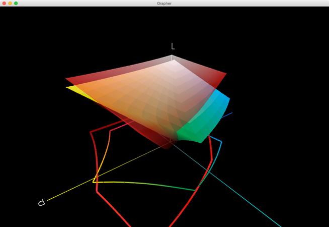
“When you overlay one gamut on another, what tends to happen is that these ‘blobs’ are different shapes,” Steve says.
“The classic example is the sRGB monitor gamut and a printing press. When you graph the two gamuts, the sRGB sticks outside of the press profile, but the press profile also sticks outside of the sRGB profile. So the RGB extremes tend to be the red, green and blues that a printing press cannot print, but there is also a bunch of cyans and greens that a printing press can produce but a sRGB screen can’t. It’s that kind of range overlap that we wanted to analyse and understand. ColorThink 4 will allow you, in a graph, to break those pieces apart.
We can calculate the volume of the parts that gamuts do or don’t share, helping people to understand the comparison between gamuts better and more numerically
“What we typically do in graphing is have the bigger outer gamut transparent so you can see the smaller gamut inside it. But what ColorThink 4 will do is calculate the volume of the parts that they don’t share or the volume of the parts that they do share. That sort of thing will help people to understand the comparison between gamuts better and more numerically.
“Also, it’ll help determine things like lowest common denominator colour spaces. That can be helpful for a printing company when figuring out the size of a colour space that all of their presses can reproduce, or better understanding the issues involved in moving jobs between presses.”
Stage four thinking
Further developments in ColorThink 4 are significant improvements in graphing colour spaces that have more than four channels, or “CMYK and friends” as Steve puts it.
“It’s a very complicated process to figure that out but we’ve made a lot of advances. ColorThink 4 also does things like show the rendered gamut. What ColorThink typically graphs today is what we call the device gamut – that’s the maximum gamut that the device could produce – but ColorThink 4 will make it easy to graph the rendered gamut,” Steve says.
It will help people to actually calculate how many colours on the list are in or out of gamut relative to a particular profile
“It’s fascinating to see that because sometimes people use a range of different inks on their presses but the profiles don’t take advantage of them. It will help people to actually calculate how many colours on the list are in or out of gamut relative to a particular profile. ColorThink 4 will do that very explicitly, so if you have a list of Pantone colours, for instance, it will tell you how many of those are in or out of gamut.
“Then, if you change the print process – perhaps you want to alter the ink but you want to evaluate how that will affect your available gamut – it will help there as well. That can be very useful and it can help to calculate the separations for that, to fine-tune them. So if you have a list of custom or brand colours, it will help tune the colour builds to get them as accurate as possible.”
And accuracy, ultimately, is key. Most of the evolutions in ColorThink 4 – including an all-new ability to allow graphing in a revised colour space other than L*a*b* – have been developed to provide better accuracy and a more realistic understanding of colour.
“ColorThink has become a great tool for all of us to understand colour better,” Steve says. “Learning is part of that but even for people who have already learned a lot about colour, ColorThink 4 offers the possibility to enhance their appreciation and ability for effective colour management even further.”
Become a FESPA member to continue reading
To read more and access exclusive content on the Club FESPA portal, please contact your Local Association. If you are not a current member, please enquire here. If there is no FESPA Association in your country, you can join FESPA Direct. Once you become a FESPA member, you can gain access to the Club FESPA Portal.
Topics
Recent news

Regulation guidance: Corporate Sustainability Reporting Directive
The Corporate Sustainability Reporting Directive (CSRD) is now in effect, but with further changes on the horizon, what does it mean for printers? Sustainability consultant Rachel England outlines everything you need to know and talks to Apigraf about how your business may be affected.

Web-to-print design: Canva versus Kittl
We look at popular design packages Canva and Kittl to determine how they compare regarding graphic design and print on demand.

FESPA in South Africa: the print skills to thrive
Printing SA’s Career Day inspired young Cape Town learners to explore printing and packaging careers.

The rise of Chinese printers
Chinese printing companies are on the rise, and have their eyes set on the UK and EU marketplace. Some have made an instant impact; others are running into issues with maintenance and language barriers. What does the future hold for Chinese printing firms, and how can you navigate working with them?